


The Color Report, Pt. 1
Talking tones—how they're evolving and how to incorporate the latest colors into your own wardrobe!

“What’s your favorite color?”
As the mom of a four-year-old, I’ve learned that this is a great go-to question to ask kids, if you don’t want a “yeah,” “no,” or “good” response. Kids even as young as two have chosen their fighter. Their favorite color is something that is part of their being, their identity. They know it, they own it, and they like to talk about it.
I can always tell which artwork is my son’s at preschool because it’s as red as the project will allow. His favorite toys are red, his favorite cartoon characters are red, and he loves to wear red. Sometimes, when I’m getting him dressed for school, he’ll say, “Mama, I wanna be all redded up today,” and so, from beat-up shoes to t-shirt, I drape him in red like monochrome royalty.
As much as kids LOVE certain colors, they also hate other colors with a similar passion. I remember my sister wearing a t-shirt emblazoned with the words “PINK STINKS!” when she was seven or eight, which I love to laugh about with her still.
These visceral reactions to tones dull as we age, but as I dig through the FW 2024 collections, I wonder if some designers are suggesting we find a way to access them again. To choose our favorite color like we choose our partner and love it purely, fully, and with abandon. That sounds freeing to me.
All Redded Up
I was struck by what a clear message came through at the runway shows this season. In all the seasons I analyzed as a trend forecaster, it was never this straightforward, which gives me extra confidence in sharing the colors that will light up our lives this year.
My son would be thrilled to know that the most striking of the season’s tones was a true, fiery red. Many designers appeared to use it as a way to shock the viewer to attention. There was a lot (A LOT!) of black and white in the shows this season, but labels like Givenchy, Balmain, and Stella McCartney seemed to use striking red as a way to break things up and make sure the viewer was still with them.
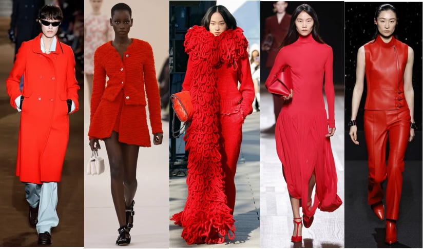
L to R: Miu Miu, Giambattista Valli, Stella McCartney, Ferragamo, Hermes (all from nowfashion.com)
The red from the runways is not just a pop of color; it’s head-to-toe, all-encompassing, immersive—all redded up, as my son would say. In reality, we don’t have to go this far, although I fully endorse the all redded up look if you have the cojones! Either way, here are a few pieces in stores now that can achieve this look:
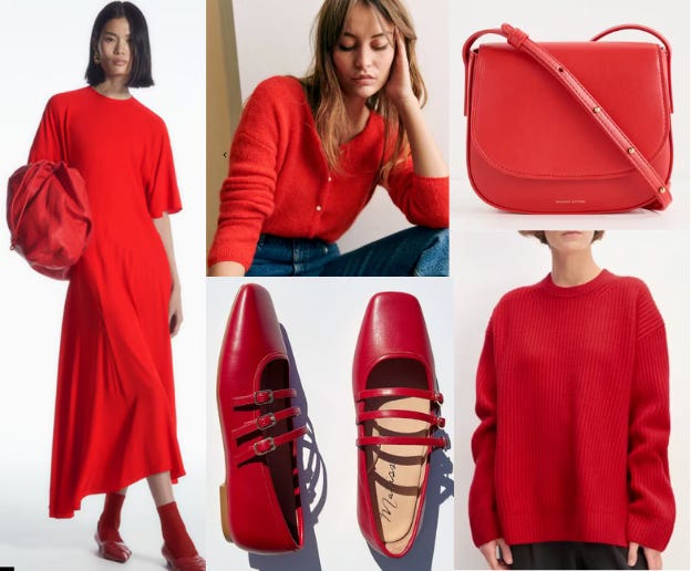
Clockwise from L: Cos “All Redded Up” Look; Sezane femme cardi; Mansur Gavriel perfect little red bag; Everlane slouchy sweater; Matisse Mary Janes
The Evolution of Butter Yellow
I’ve been noticing a lot of internet chatter about butter yellow—lots of pieces in the tone from the SS 2024 runways are hitting the stores now, and they’re causing a buzz. I am pleased to say that if you buy butter yellow now, it will still look good in fall. I’m still seeing it on the runways a bit, but what interests me more is how it appears to be evolving. Instead of butter yellow, some designers are either making it more subtle and veering towards cream or cranking up the volume on the yellow. I’ll show you examples of both approaches:
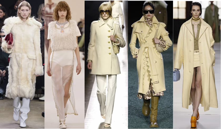
L to R: Proenza Schouler, Giambattista Valli, Tom Ford, Burberry, Gucci (all from nowfashion.com)
This selection shows the range of the lighter evolution—from nearly-white to almond, and it demonstrates just how versatile this tone is. It looks good on everything from underwear to outerwear!
And now for our brighter yellow friends!
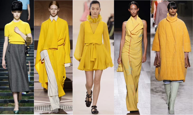
L to R: Prada, Issey Miyake, Giambattista Valli, Ferragamo, Dries Van Noten (all fromnow fashion.com)
I first noticed this color at Prada because it looked so jarring paired with the grey wool skirt. My sister once told me that yellow is the color most likely to make people feel angry and irritated, which is confirmed here and in other psychology articles. And yes, this yellow did irritate me at first, but the longer I look at it, the more I feel there’s something edgy about it, irreverent even. It’s a tough color to wear, but I think it’s worth a shot for the more daring among us!
Here are some yellow(ish) faves from the shops! Light, then bright.
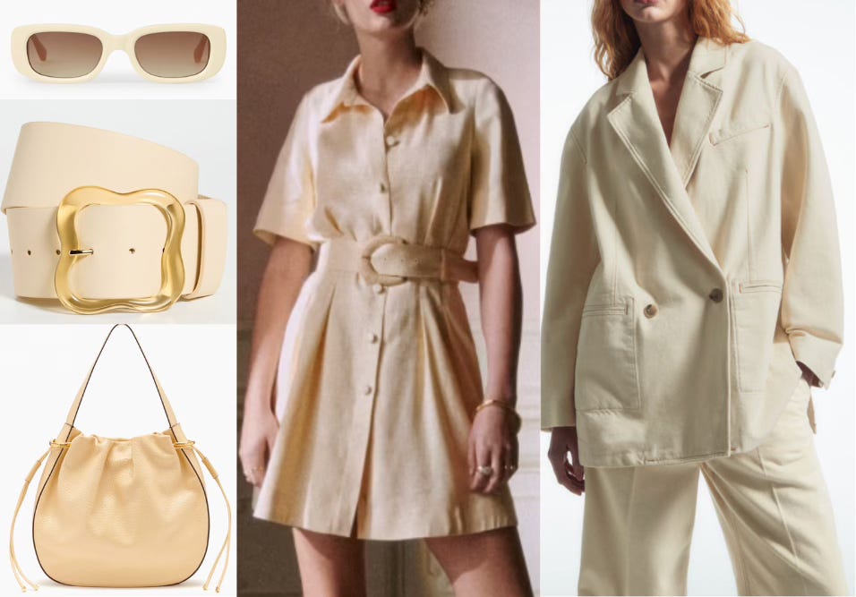
Top to bottom, L to R: Cos sunnies; Lizzie Fortunato belt; Ulla Johnson bag (oops, kind of pricey - sorry!); Sezane shirt dress; Cos oversized denim blazer.
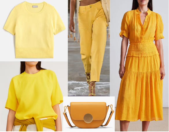
Clockwise from top L: J. Crew cropped cashmere sweater; Ulla Johnson pants; Apiece Apart dress; Oryany bag; Everlane raglan tee.
Khaki Is Back-y
Oh god, sorry about this title! I shouldn’t be trusted to write things when I’m highly hormonal. But yes, I’m seeing a notable amount of khaki this season, which is a color that hasn’t looked right in a WHILE! I’m considering it a replacement for navy, which has pretty much gone away for now. It’s a relatable, classic tone, but it looks new here in suiting and casual items.
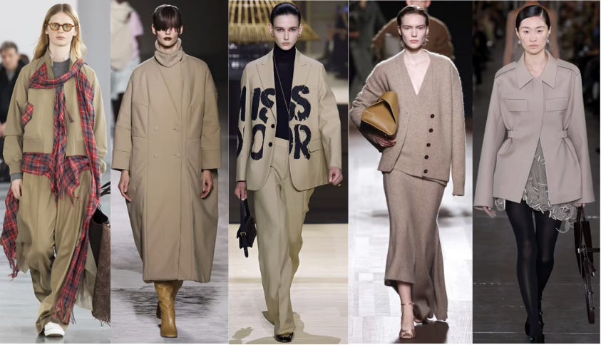
L to R: Undercover, Dries Van Noten, Dior, Ferragamo, Tory Burch (all from nowfashion.com)
In the shops, there are absolutely beautiful trench coats to scoop up now, as well as less conventional items in our new favorite neutral.
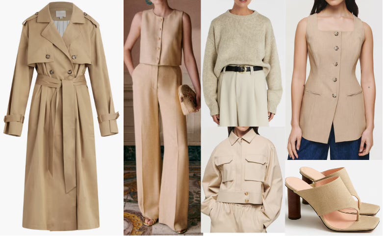
L to R, then Clockwise: Favorite Daughter trench; Sezane linen look; DISSH chunky sweater; Aligne boxy blazer top; J. Crew linen mule/sandals; Aligne cropped cargo jacket.
Alas, Substack has informed me that including all of my color callouts will make this email too long, so I’ll be back later this week with a separate newsletter featuring the last two tones, and boy are they beauts, so don’t miss it!
xx,
Joanna
Bravo. Fun and informative! Love the personal side notes.